Showing posts with label Analysis of my Finished Products. Show all posts

Thursday, 6 March 2014

On Sight Trailer Analysis

My trailer starts the green screen as normal and follows with my production company name. This production company name is accompanied by the start of the song that I have used for my trailer. This song is "Do I Wanna Know" by The Artic Monkeys. This shows the viewers the production company who created the film trailer and the film. It is accompanied by the music as this music starting before the moving images does means that the first impressions for the audience start to surface what the genre for the film is.

This second shot you can see is an establishing shot of Liverpool. This establishing shot allows the audience to see the setting in which the film will take place. Having the establishing shot showing the Albert Dock means that the audience should immediately recognise it as it is iconic and famous. Therefore the viewers will be able to establish that it is set in Liverpool.

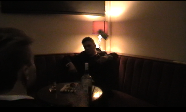
From the last shot the trailer moves onto showing the audience the main character stumbling out of the pub. However the viewers cannot determine that he is the protagonist yet. They just see a drunk. Then in the shot to the left we see him for the first time lying down. From the early stages we see him as an alcoholic as he is in the pub at this stage. However he is having a conversation with the helper in the story Julianne. The low key lighting and the dark clothes show a lack of happiness between the two as they look down and depressed. The way that the beer stand separates the two show that they may have two different views and this is strengthened as Connor looks like he isn't interested in what Julianne is saying. The beer stand is also white and bright which may suggest that alcohol is there only happiness/escape from depression.
The next shot is introducing two more new characters to the viewers. We have the main antagonist Nikolai Piesto who is throwing the money and the second is a mobster/contracted assassin. This has also has low key lighting however this shows that there is trouble arising and that the clip suggests that the mobster is being paid to do a job. The props on the table also suggest that this is some kind of warehouse/safe house for the antagonist.

Here we have the continuing theme within the trailer of our main character stumbling out of the pub drunk. The setting and grainy editing suggest that he is drunk and is disorientated. This may show the viewers that he has a confusing lifestyle and isn't comfortable with it. This may also suggest that this is in the past compared to other shots being in colour. He is also in the pub. The use of expansion of time is used to show that he is walking somewhere. Before this shot there are couple of quick shots of Nikolai using his power. He forces a male into the chair and looks like he is about to interrogate him in some.

Before this next shot there are a few more stumbling shots of the main character and the helper Julianne leaving a building in a fast paced walk. The way in which he is leaving suggests that he is trying to get away from someone however he is not trying to look superstitious.
As you can see on your right there is a shot of gold cards being thrown down in the trailer. This shot is the 4th card being thrown. This looks like another common theme even after only two cards. This looks like a countdown being made so the viewers might feel at the end of this that something is about to happen.
From the last shot there are a few twists in the trailer as the stumbling grinds to a halt as Connor is confronted by to mobsters who are connected with Nikolai. The title screens suggest that something happened in Connors past that is relevant to what is happening now. The next few shots suggest that he is going to go toe to toe with Nikolai and try to fight of what he is about to receive.


The title screen shown just before this shot tells the audience that Connor has to eradicate the past. This suggests that there are people who have caught up with his life and have made it tough again. The shot you can see on the right is showing that Connor is fighting off the mobsters. The transition from a grainy look to real time colour suggests that he has broken away from his drunk state and is fighting back.

There are several shots following the last shot you can see above. These shots include another card shot, and the introduction of a speedo. This speedo comes in and is another theme that is present in the trailer for a short amount of time. As the speed goes p the tension builds up in the trailer from an audience perspective. The shot we can see now is an over the shoulder shot of the main character Connor who is making a phone call. The angle that the audience are at suggests that they are peeping over his shoulder and being nosey. The way in which Connor n this section says "I've got what you want" suggests that he is being used in someway to get to other things for someone else.


The speedo theme continues and finishes within the section between the last shot and the shot you can see on the right. The speedo is shown increasing in speed as the action quickens in the rest of the trailer. There are shots of Nikolai smashing through the door looking very angry and then there is this chase that you can see on the right. This is showing that you as the viewer is getting chased through a POV shot. This increases the intensity further and the fact that the lens makes it look dirty and rough means that you are very rural and looks like you have no where to turn as you are chased. This shot transitions into a car driving away. This continues the quick intensity and makes the viewers think of who is driving the car. The antagonist or protagonist and why they are driving away quickly.

This shot is of the suitcase that the mobsters where carrying earlier in the trailer. Once opened the bang matching the bad connotations of the drugs in the briefcase suggest that Connor has unearthed something that he didn't want to get back into as it is something that he has just left. The dark setting also plays a negative angle on this as it increases the negativity that is associated with this image. This point leads the trailer nicely into the introduction of the actors who are in the film. The actors names are shown individually with each of there characters shown in a shot individually that they play within the film.

After the names the final of the cards is thrown down. This card is the joker and concludes the countdown. This then cuts to Nikolai cocking the gun and shooting down the camera. The angle in which it is shot is suggesting that the viewer is in a low angle POV shot. This is showing they may be looking through a character who is about to get shot. This then cuts to the title of the film. This is done in a way that the viewers can make there own assumptions about who got shot. Cutting to the title at the peak of the intensity makes sure that the audience remembers what the film is called.

This final part of the trailer after the title. This part is in a dark room with very low key lighting. This being in a dark room suggests that something bad is about to happen and that things are hidden. This suggestion comes to the fore when Connor answers the mobile he is kidnapped. Ending the trailer on this is leaving a cliffhanger for the audience. They want to know what happens to him but to do that they'll have to go and watch the film.

On Sight Poster Analysis

This is my poster for my film trailer. As you can see the main character within my trailer is slap bang down the middle of the poster. Having it down the middle shows that he is the main character within the story and that he is the fore front and therefore the brand image of this film. The main character is wearing all black with a white shirt. This shows that the character is a character who is confused and styles within the story clash with each other. The white is quite bright on the shirt and this is what the audience may be attracted to first. This is good as it is attracted to the main character however it is to his short and not his face. The character stand out however from the setting in which he is in. The black and white jackets also suggest that he is has bad but is turning good because of the clash I was talking about.
 
The briefcase that is holding is also slightly light even though the natural colour is a dark black leather briefcase. The light sparkle that it has given is quite good as it puts that doubt in the owners mind of what is in it. The light grabs the attention but the briefcase isn't a bright light it is more of a lower case dark light which suggests that It contains something bad.
 
The car in the background is at an angle and blends in with the background but not too much that it cant be seen but enough so that it can be seen. The way the car is angled suggests that someone has jumped out to get something and then able to jump back in and get away. From the audience perspective they might think that this has been done so that the main character can jump back in and get away with this package of his. The cars number plate is also hidden by the character. This may show that the character wants to cover his tracks and doesn't want to be followed.
 
The setting behind is dark and has minimal lighting. The lighting is enough to show what the setting is kind of like. From what we can see is that the setting is quite rough and off the charts as it is away from main roads. It gives out a feeling of a place that you would want to stay away from if you could. However the setting itself is blurred so that the audience can't see all of it. This is so the audience don't see what the setting is fully like as it may have a few key features within it that they may not want the audience to see.
 
The Title is bold and shown in a rough way as it covered in barbed wire. This further implies that the story is set in a rough area. The title is placed behind the main character as it can still be seen by the audience but it is not the main feature within the poster. They want to make the main character the main focus by putting it in front and then the title will be looked at from there. The actors name is placed above the title. Only one of the actors names is placed above. This shows that he may be one actor that is a pulling point for the film. Therefore by having the actors name within it may bring audiences alone to go and watch the film.
 
Finally at the bottom all of the billing information and the companies names who worked on it. These explain who has worked on the film and which individuals have worked on the film.

On Sight Magazine Analysis


This is my film magazine. It is my edition of Empire of empire magazine. From what we can see immediately is that the magazine may point within the issue is the picture on the cover. This picture is of my film On Sight. From what we can see is that the magazine doesn't follow normal conventions of a film a trailer and the character is faced away from the audience. This shows that he doesn't want to be looked at or noticed so therefore this connects with the poster that he wants to cover his tracks. The shot is also a low angle shot showing that the setting is towering over the main character. This shows from the audience perspective that he is up against something that is of more power compared to himself. The person who lives or is in this house is probably bad in the trailer. We can see that the briefcase features once again in a product. Like the main character it is a key feature for the film and stands out as one of the brands/films emblems that stay in peoples minds. You could also say the same about the leather jacket. The main character is in front of the Empire magazine. Like other Empire magazines this follows the conventions and is effective because of this. It stands out and is what the audience will see first therefore attracted to this image first instead of the title. The title doesn't need to stand out however as people who buy the magazine know the magazine and the brand. The main character is also in colour whereas the rest of the magazine is in an old fashioned grainy colour. This is effective as the main character stands out but it also signals to the audience that the main character has been in a place where he doesn't belong. Also the text above the Empire masthead is connected and relevant to the main image. The image being the way it is and the actor having an interview inside may entice the audience to buy the magazine and find out what he looks like and see what the film is like. Also see if he gives anything away about it.
 
The On Sight word and subtitle below are in bold, white and red. This shows to the audience that this is what the main image is connected to as this text is the biggest and stands out the most. The fact that it is by the main image anyway shows that they are connected. The remaining text down the left are all done in the same font however they are in colours and sizes. At the top we see that one of the other stories within is about the Bafta nominations. This is shown clearly through the title of the news in a banner. Having three film names below this then in bold writing also shows me as the audience that they are connected. The Bafta banner stands out but it isn't to big that it pulls attention away from the main names below it as these film names alone can attract the audience to go and watch the film. The text at the top on the left are bigger compared to the rest of the writing down the left. This shows that they are trying with the pulling the audience with the names that stand out. However the colour on the text means that they stand out but they don't take the full attention away from the main image. The rest of the text down the left are other issues and news that will be covered within. The TV shows subtitle is quite big to show that this is included however the TV shows that are on are in smaller writing so that they can all be shown and that they aren't the main attention. The other image within is a screen shot of The Wolf Of Wall Street. This screen shot pulls attention on the front of the magazine however the size limits it to attention after the min image and the enlarged writing above it.

The masthead has been done like an Empire magazine that the fact it has the same style however the masthead is slightly transparent. This is to show may have been done to show the full effect of the image and the setting for the main image. Even though it is transparent it stands out really well and is like most other Empire magazines. The other information regarding price and URL are placed by the Empire masthead. This is like most Empire magazines. Finally the barcode has been placed down the side on the right of the magazine. This is here because it looks like the normal position that barcodes go in the bottom right has been given as extra space for the main text. Therefore it has been placed to one side which some Empire issues do follow sometimes.